Charles Joseph Minard’s name is synonymous with an outstanding 1869 graphic depicting the horrific loss of life that Napoleon’s army suffered in 1812 and 1813, during its invasion of Russia and subsequent retreat. The graphic (below), which is often referred to simply as “Napoleon’s March” or “the Minard graphic,” rose to its prominent position in the pantheon of data visualizations largely thanks to praise from one of the field’s modern giants, Edward Tufte. In his 1983 classic text, “The Visual Display of Quantitative Information,” Tufte declared that Napoleon’s March “may well be the best statistical graphic ever produced.”
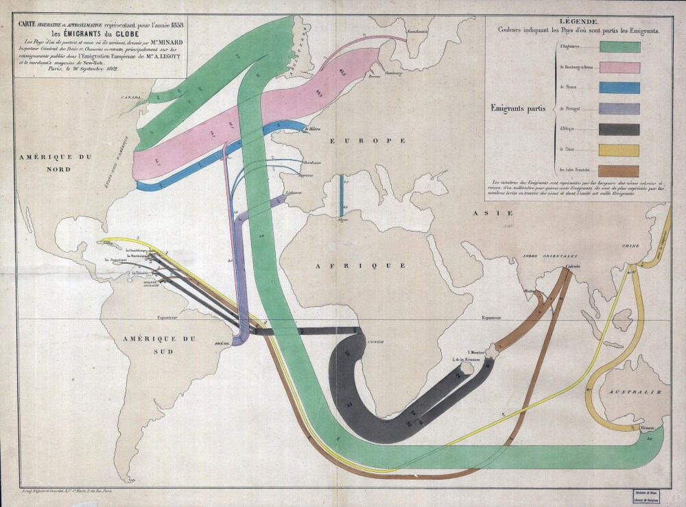
Today Minard is revered in the data-visualization world, commonly mentioned alongside other greats such as John Snow, Florence Nightingale, and William Playfair. But Minard’s legacy has been almost completely dominated by his best-known work. In fact, it may be more accurate to say that Napoleon’s March is his only widely known work. Many fans of the March have likely never even seen the graphic that Minard originally paired it with: a visualization of Hannibal’s famous military campaign in 218 BC, as seen in the image below.

On its face, it may not seem remarkable that Minard is remembered for this one piece of work; after all, many people owe their fame to a single great achievement, and the Napoleon graphic is certainly worthy of its reputation. But Minard was most definitely not a one-hit wonder.
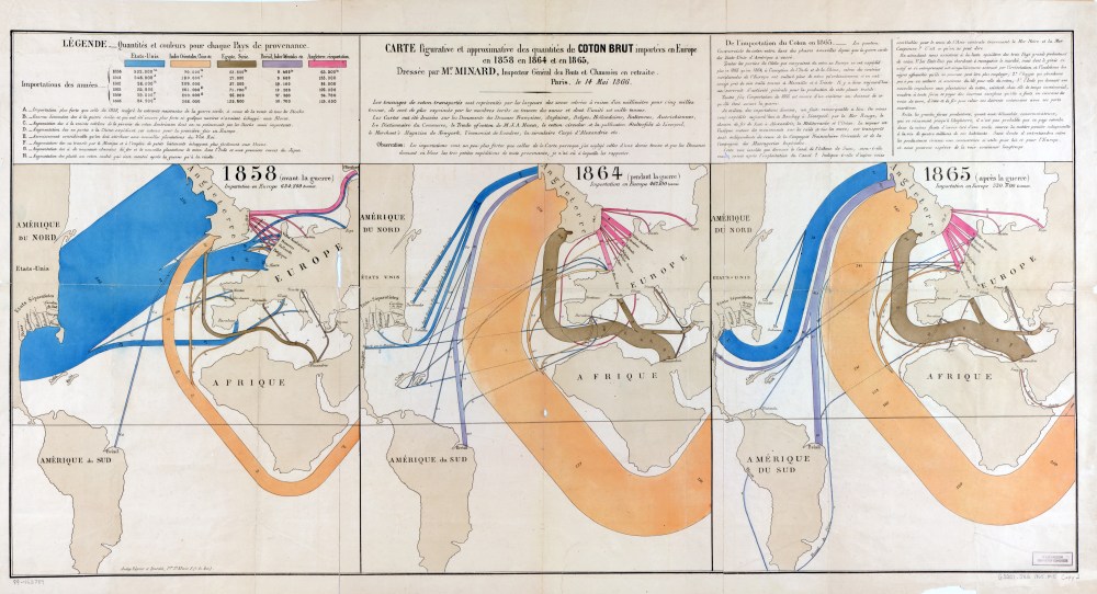
Minard made scores of other graphics and charts, as well as nearly 50 maps. He pioneered several important thematic mapping techniques and perfected others, such as using flow lines on a map. A great example of this is the trio of maps in the graphic at the top of the post, which depict cotton imports to Europe.
It wasn’t until I met R.J. Andrews, the visual storyteller behind the website Infowetrust.com, that I learned about Minard’s prolific career. Andrews has been studying the history of data visualization and writing a series of posts about some of the field’s “sacred cows.” When he started looking into Minard, he found a trove of his work in the digital archives of the École Nationale des Ponts et Chaussées (National School of Bridges and Roads), where Minard was an instructor.
Minard made some of his charts and maps during his engineering career, which culminated in his appointment as inspector general of the school. But it was after he retired, at age 70, that he really poured himself into crafting his “graphic tables and figurative maps,” as he called them. The Napoleon and Hannibal graphics were among the very last he made, at age 88.
Minard wasn’t the first to put flow lines on a map, but he really raised the bar for doing so. The maps are all designed to tell a story—to “speak to they eyes,” in Minard’s words.* He mapped the flow of everything from coal and wine to people and languages. He always prioritized the data, often distorting the underlying geography to accommodate it.
In some cases, such as the cotton import maps, he charted the same data over time. In the video above, Andrews explains how the cotton maps tell the story of an emerging global economy and the impacts of civil war.
The invention of the pie chart is credited to Playfair, but again Minard took an existing idea and vastly improved it. He was the first to use pie charts on a map, and he added his own innovation: turning the pie charts into proportional symbols.
One of his first pie-chart maps shows the origin of butcher’s meats supplied to Paris markets in 1858 from each of the country’s departments. The size of the pies indicates how much total meat came from each location. The colors indicate which type of meat: black for beef, red for veal, green for mutton. All the departments in yellow contributed some meat, and the meatless areas are tan colored. A century and a half later, cartographers are still using the technique.
Andrews also discovered that, unlike now, Minard’s work was widely known and appreciated in his day, at least among government officials. Buried in a 15-year-old scholarly paper, Andrews found an intriguing passage of Minard’s obituary translated from the original French. It said that from around 1850 to 1860, all the ministers of public works in France made a point of having their portraits painted with one of Minard’s charts in the background. This sent Andrews down a rabbit hole in search of those portraits. You can read Andrews’ account of the hunt and what he found out.
*Friendly, Michael (2002). Visions and Re-Visions of Charles Joseph Minard. Journal of Educational and Behavioral Statistics, Vol. 27, No. 1, pp. 31-51.
This article was originally published on our blog All Over the Map at National Geographic.
