People seem to trust maps more than other forms of conveying information. It’s one thing to read that a city is racially segregated; seeing it on a map makes it seem more real. Our natural inclination to believe whatever we see on maps makes them excellent tools of persuasion.
This unique power has put maps at the center of many propaganda operations, morality movements, and political debates. Just last week, a map showing which parts of the country would be hurt by a U.S. withdrawal from the North American Free Trade Agreement (NAFTA) helped persuade the president to scrap that plan.
“Almost every child has a recollection of a parent unfolding a road map when you’re very young, and then driving to some place where you’ve never been before by following the map,” says P.J. Mode, a retired lawyer who collects maps that were specifically designed to persuade people in one way or another. “You learn when you’re tiny, from watching your family, that you can trust a map, the map is dependable, it gets you from A to B.”
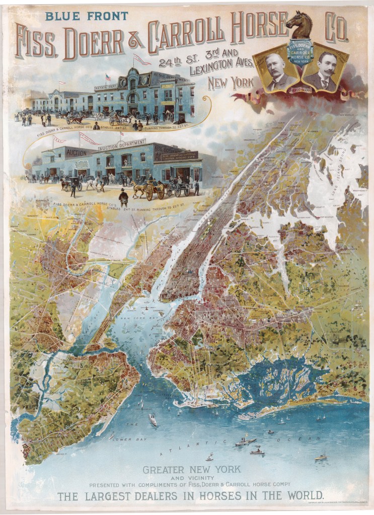
Mode has amassed more than 800 “persuasive maps,” most of which can be seen online as part of the Cornell University Library’s digital collections. More than 500 of these became available online in April. Over a hundred of the maps represent some form of advertising, such as the beautiful map of the New York City area at the top of the post—one of Mode’s favorites—from an 1897 ad for “the largest dealers in horses in the world.”
Advertisers like using maps “because they carry a greater presumption of credibility than any other medium of communication,” Mode says. “Advertisers live and die for greater credibility, and therefore they gravitate to the medium of cartography.”
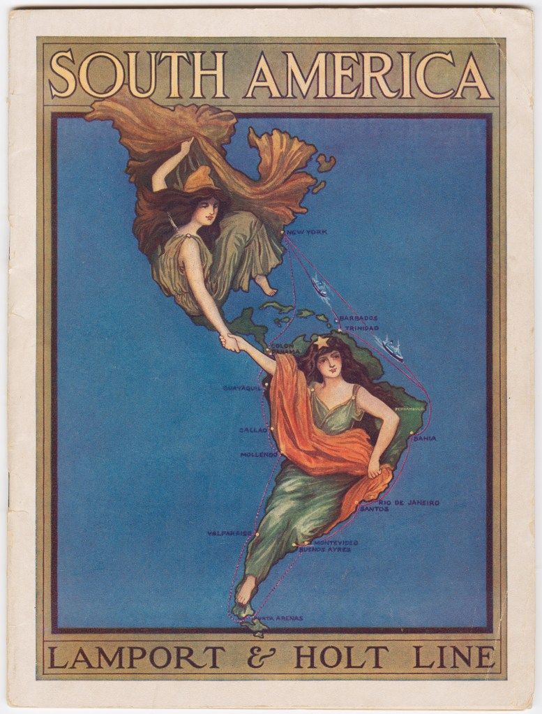
According to Mode’s research, a British shipping company ripped off the logo of the 1901 Pan-American Exposition in Buffalo, New York, for the cover of its 1912 promotional brochure (above). “This brochure, which is illustrated with this cover—it’s really quite beautiful—never attributes it,” Mode says. “I’m sure they were violating somebody’s copyright.”
When the original logo was created, the artist, Raphael Beck, was selected from among 400 applicants, and a beauty contest was held to find two women to serve as models. “This logo was plastered everywhere, on things from the Pan-American Exposition,” Mode says. “And 10 years later, this steamship company, the Lamport & Holt Line, stole the image and put it on their advertising.”
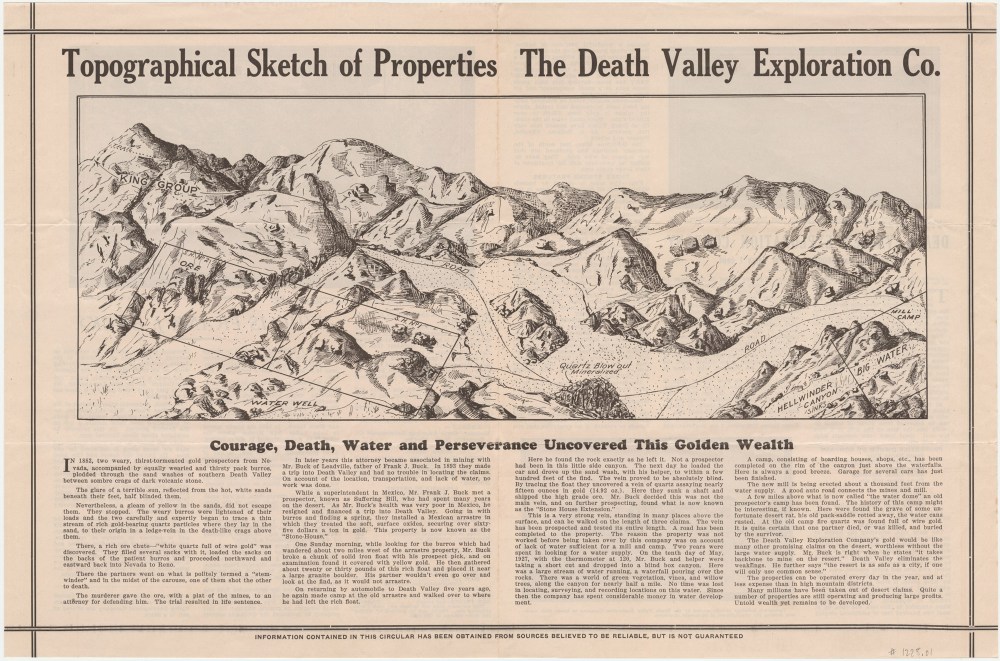
Some of the most intriguing maps in Mode’s collection are guilty of another type of illegal activity—fraud. The map above is from a 1929 brochure for the Death Valley Exploration Company, which claimed to have found a rich vein of gold in Death Valley. The brochure was meant to tempt investors into buying shares in the mining operation. “Untold wealth remains to be developed,” according to the text below the map, which, like the rest of the brochure, was designed to look like a newspaper story (probably to further enhance its credibility).
The map is a bird’s-eye view showing the location of the company’s stake, where the ore was found, and—critically for an operation in Death Valley—where there was water. In the lower left corner of the map, in “Hellwinder Canyon,” a spot is labeled “Big Water.”
“Of course there is no ‘big water,’” Mode says. Nor does it appear that there was a “very strong vein” of “high grade ore,” as was promised in the brochure. Two years later California barred the company from selling further shares in in the state.
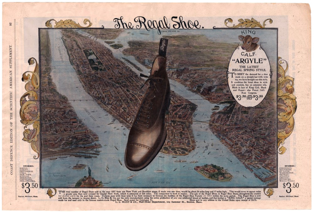
In a somewhat odd attempt to justify superimposing a giant shoe on a map of Manhattan, L.C. Bliss & Co. included this factoid in its 1898 ad for shoes: “The total number of Regal Shoes sold in the year 1897 from our New York and Brooklyn stores, if made into one shoe, would be about 34 miles long and 17 miles high. This would cover in square miles a greater area than now covered by Greater New York.”
Mode says this ad shares some elements with several others in his collection. “One thing you’ll see is that a lot of them from the late 19th century use bird’s-eye views of Manhattan,” he says. He suspects this was inspired by the Brooklyn Bridge, which had recently been completed and was considered to be very significant.
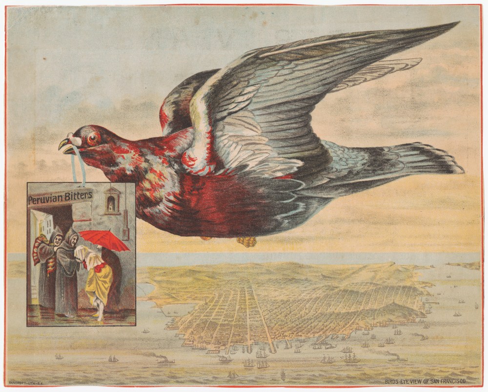
A remedy sold under the name “Peruvian Bitters” made an impressive list of claims on an advertising flyer from the 1880s. The concoction “conquers death-dealing malaria, kills dyspepsia by removing its cause, destroys a morbid appetite for stimulants, and restores health and consequent happiness,” according to the back of the ad. “None can afford to be without it!”
The front side of the flyer (above) features a pigeon flying over a lovely map of San Francisco, carrying a scene that shows a woman kissing the hand of a monk (who is presumably providing her with the Peruvian Bitters miracle cure).
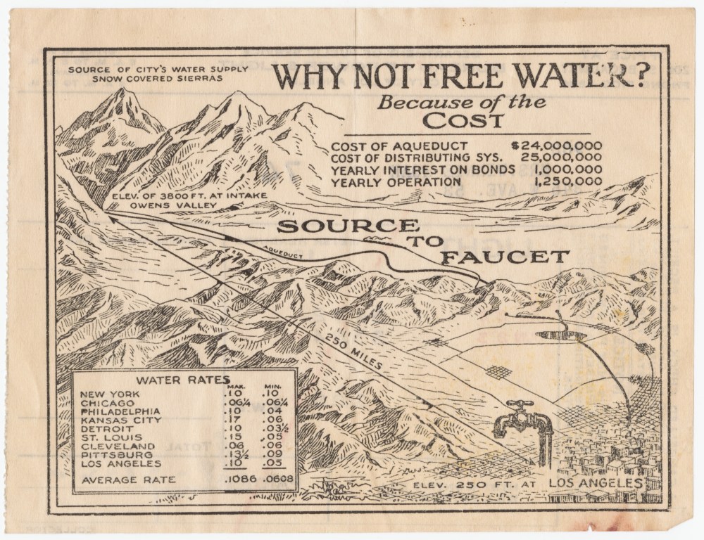
The map above, from the back of a 1922 electric bill, was designed to convince residents of Los Angeles that it was fair for them to have to pay for their water. The map shows the $50 million aqueduct’s nearly 250-mile route from the Owens Valley in the Sierra Nevada to homes in L.A.
Mode loves researching the stories behind the persuasive maps he collects. Most of the maps online at Cornell have Mode’s notes based on his research. “The Internet of course is key,” he says. “You could never do this without the Internet, because there’s such a vast amount of information readily at hand.”
Still, some maps require a little more creative digging, or even the purchase of an antique book or two. But Mode is easily persuaded by his curiosity to do the extra work.
This article was originally published on our blog All Over the Map at National Geographic.
