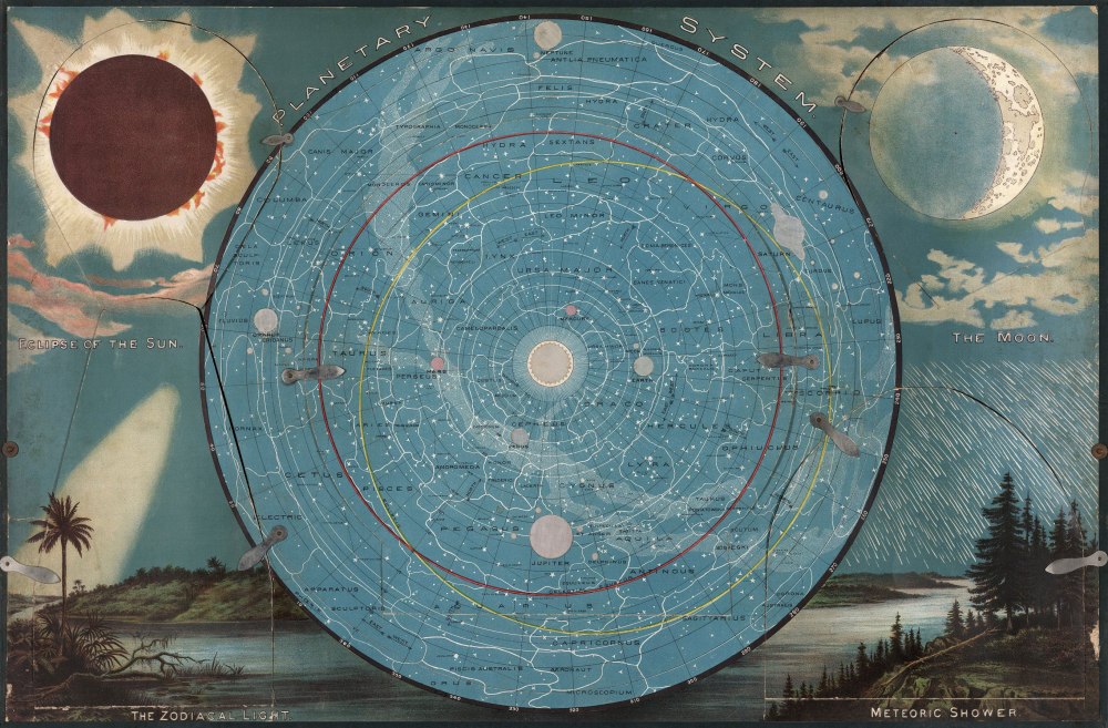
FOR 19TH-CENTURY SCHOOLCHILDREN, this colorful star chart would have brought astronomy brilliantly to life. Through vivid images, hidden flaps and sliders, and clever use of lighting effects, the chart was designed to help teachers illustrate Earth’s place in the universe.
The star chart was part of a kit, called Yaggy’s Geographical Study, produced for teachers in 1887 by Levi Walter Yaggy, an inventor-turned-publisher who held several map-related patents and owned a Chicago publishing house. Contained in a canvas-covered plywood box, the kit contained a variety of maps and charts depicting the world and its climatic zones and peoples. Each map is roughly 2 by 3 feet.
“You open it up like a box of treasures,” says Matthew Edney, a historian of cartography at the University of Southern Maine. “There’s nothing else like it.”

Wall maps were commonly used in classrooms at the time, Edney says, but the combination of teaching aids in the Geographical Study is unusual. Built into the back of the case, for example, is a 3D relief map of the United States made of papier-mâché or plaster. “It’s impressionistic, ” Edney says, because the precise heights of mountains and other features of the terrain weren’t systematically measured until decades later. “But it’s a pretty unique object for its time,” Other charts illustrated the climatic zones of the Earth and the layers of rock beneath its surface.
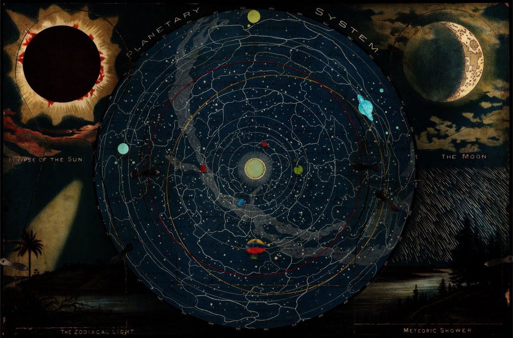
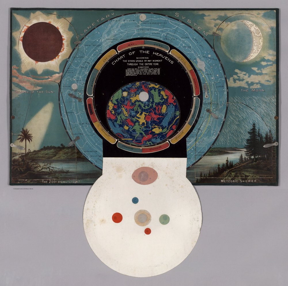
But the star chart is the most unusual and interactive of all. It has five panels held in place by tiny metal latches. Each panel can be opened to reveal a more detailed diagram. One shows the phases of the moon, for example, while another includes a slider to illustrate how the position of the sun changes relative to Earth with the seasons. The star chart is designed to highlight certain features when a bright light is placed behind it (see above).
A handbook accompanies the portfolio, giving teachers suggestions and even sample dialogue for using the kit to teach geography to young students even before they’re able to read a textbook. The handbook suggests using the star chart in the very first lessons to establish the position of the Earth in the cosmos before discussing its geography.
Although the chart would have made a fair introduction to basic topics in astronomy, it’s not without some problems, Edney notes. It shows the cosmos from an impossible point of view, for example: showing the stars as they appear from the northern hemisphere on Earth, but showing the solar system as it would appear from a point in space somewhere above the sun. In addition, the orbits of the planets are drawn as circles (in reality they’re ellipses), and the intervals between them are not drawn to scale.

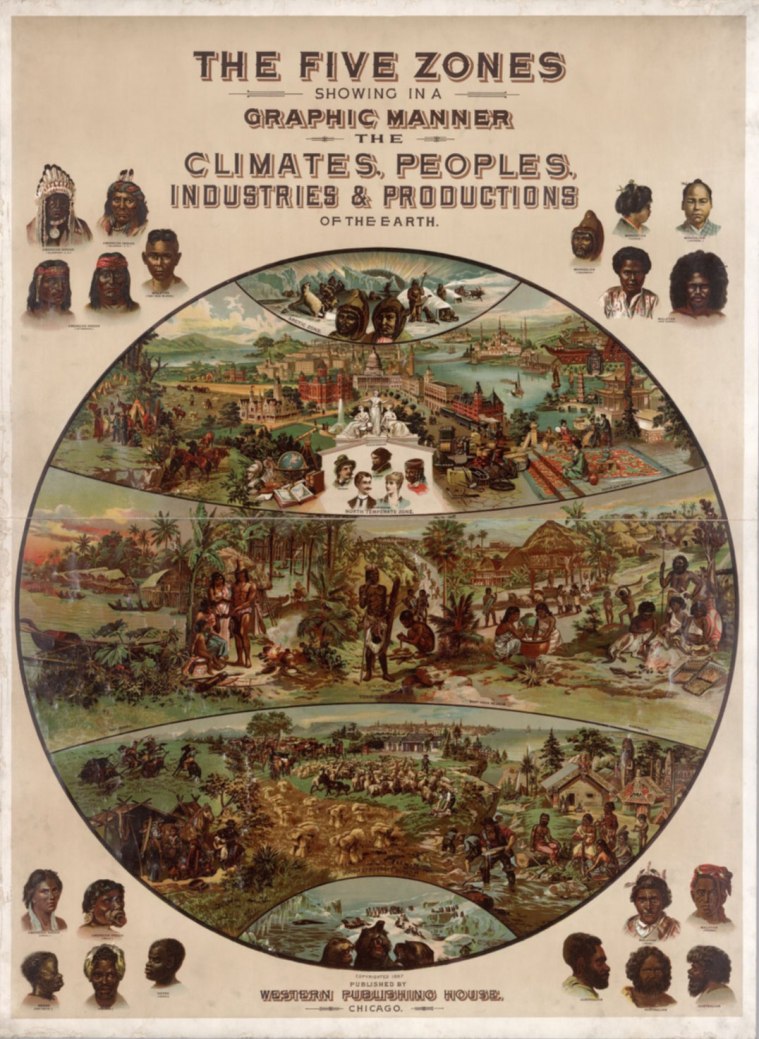
There are additional features of the kit that don’t stand up to modern scrutiny, like a chart showing the world divided into five climatic zones, each populated by a certain type of flora and fauna, and each conducive to certain types of cultures. The chart reflects the racist Victorian-era assumption that temperate climates, such as those in Europe and North America, are fertile ground for advanced civilizations, whereas the tropical climates of Africa and South America promote laziness and self-indulgence, and give rise only to more “primitive” cultures—wholly incorrect by every modern scientific and anthropological standard.
It’s impossible to say how many copies of Yaggy’s Geographical Study were produced or how widely it was used, Edney says, but the release of a second edition in 1893 suggests it was fairly popular. The kit is featured in an ongoing exhibit he curated at the Osher Map Library and Smith Center for Cartographic Education in Portland, Maine. The images here were recently scanned and put online by the David Rumsey Map Collection.
This article was originally published on our blog All Over the Map at National Geographic.
